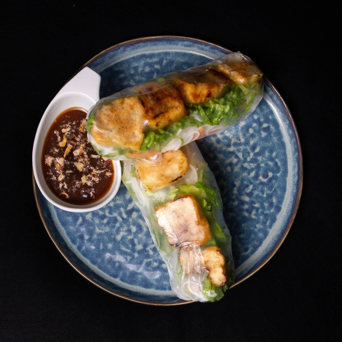
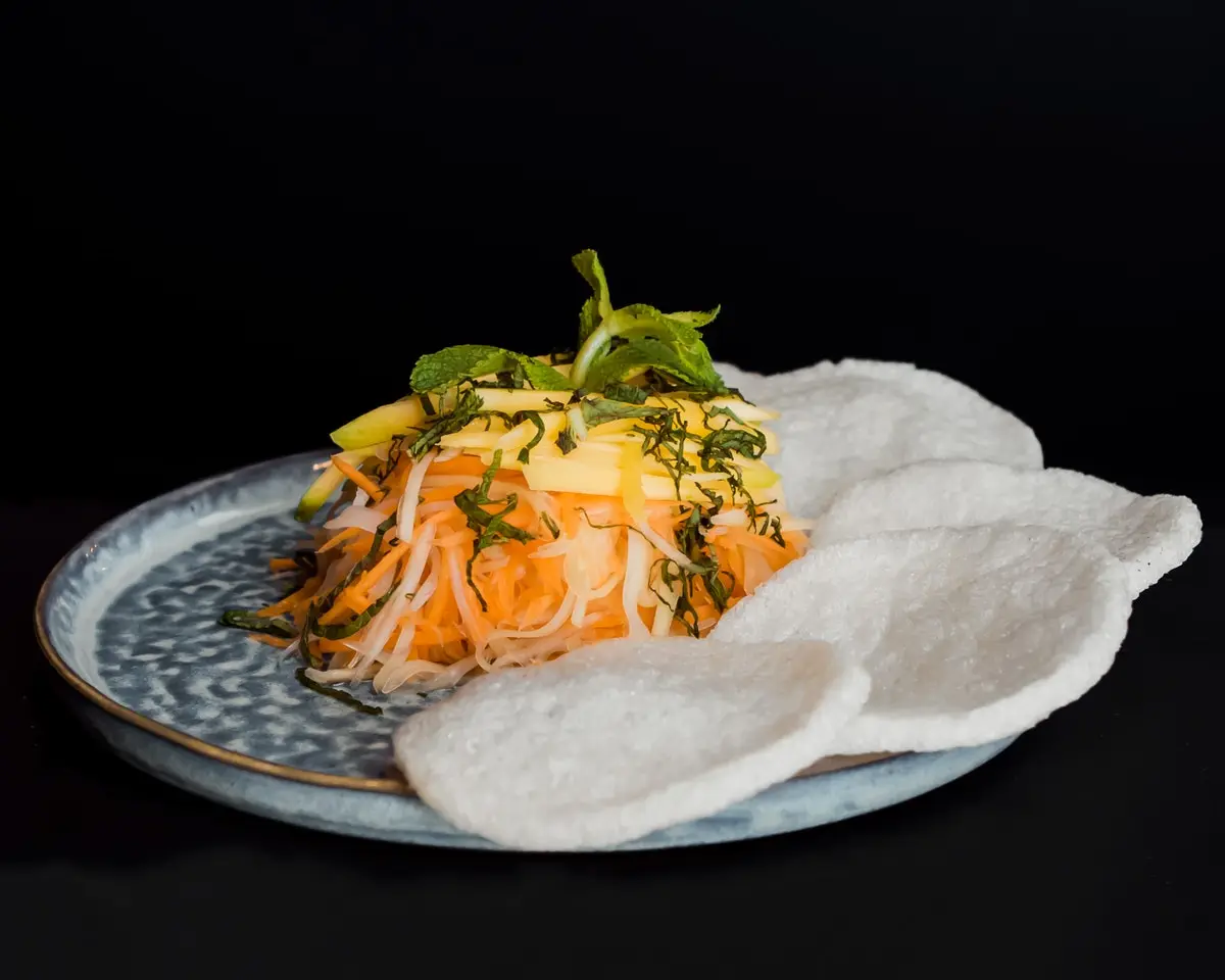
Saigon Restaurant approached me with the need for a static website that would provide their customers with a user-friendly interface. The client already had a website and provided two additional websites as examples of websites that they liked. This allowed me to bypass the design phase typically done in Figma and iterate directly in development.
Client’s Requirements
Easy Navigation: The client wanted an easy-to-navigate website where everything was accessible with minimal clicks.
Prominent Food and Drink Menus: The client wanted the
FOODandDRINKSmenus to be themain focusof the website.User-Friendly Food Menu: The client wanted to simplify the navigation of the food menu, especially in mobile view, to make it easier for users to browse through the items without having to scroll extensively.
Communication and Information: The client had specific requirements to ensure easy communication and information availability. These included:
- Business Hours and Location: The client wanted to provide customers with information about their operating hours and location.
- Contact Information: The client wanted to share their address, phone number, email, and social media handles.
- Contact Form: The client wanted a form on the website for customers to reach out to them.
Development Approach
Single Page Site: I decided to develop the entire site as a single page with different sections. This approach makes everything within the site accessible with just one click, providing ease of navigation.
Section Outlining: Before starting the development, I outlined the different sections of the site that I believed the client needed. I then identified the different components within those sections. This allowed me to build the site component by component, section by section, thus making it easier to show progress to the client and receive feedback.
Visible Main Navigation: In alignment with the client’s current site and the two examples they provided, I developed two alternative main navigation menus; the traditional mobile viewprot ‘hamburger’ icon menu and an alternative menu, without the ‘hamburger’, that is always visible on both mobile and desktop viewports. After experiencing the benefit of ease of access in the customer’s user experience (UX), the client favored the always visible navigation approach.
Interactive Menu: The restaurant menu prominently features interactive
FOODandDRINKSbuttons within the viewport across a range of screen sizes, from 320px to 1024px. This directly addresses the client’s need for the food and drinks menus to be the main focus of the website. Additionally, ahide imagesbutton is provided that hides all the images of food and drink items, allowing more items to be displayed in the viewport and thus, reducing extensive scrolling as per the client’s requirement.Takeaways
- Near Real-time Feedback with ngrok: Throughout the development process, I used ngrok to provide the client live updates on each section of the site. This allowed the client to provide feedback quickly, ensuring that the final product would align with their vision. This made the development experience amazing, as I was able to iterate very quickly. I understand I won’t be able to do this with all clients, but when it works, it’s simply fantastic.
- Understanding Client Needs and Communication: I initially set up a newsletter using Brevo.com based on my understanding from my conversations with the client. However, it was later deemed unnecessary. This experience highlighted the importance of sharing my checklist from the
2. Section Outliningphase of my development approach with the client at the start of a project. This checklist can help me avoid wasting time on unnecessary features, even before I get feedback from the client through Ngrok or another means.
Technologies Used
Challenges
- Contact Form Implementation:
Implementing a functional contact form was a significant challenge.
- First Attempt: I initially tried
Nodemailer, a Node.js package, for implementing the contact form. - Issue:
Nodemailerwasn’t supported in the Cloudflare Workers environment. - Second Attempt: I then switched to
fabform.io. - Issue: Encountered limitations such as the inability to customize the from part of the email and handle post-submission behaviour.
- Final Solution: Discovered that SendGrid provides
RESTful APIs, which are universally compatible since they use HTTP. This made them a viable solution for the Cloudflare Workers environment.
Takeaways
- Platform considerations: I learned the importance of understanding the environment in which your code will run and ensuring compatibility between your chosen technologies. I have now made this process an early item in my development checklist.
- First Attempt: I initially tried
New Learnings
- Cloudflare Pages and Workers: Gained further experience working with Cloudflare as a hosting platform and Cloudflare’s serverless Workers environment.
- Working with SendGrid: Explored SendGrid’s
RESTful APIsand dashboard for the first time. - Newsletter Form with Brevo.com: Learned how to set up a newsletter form using Brevo.com.
- Using Nodemailer: Acquired skills in using Nodemailer, a Node.js package for sending emails.


